 Largest Ceiling
  CALL :
  About us
 FAQs
FAQs Gallery
 Contact


 Ceiling Planks
 2×2 PVC Ceiling Tiles
 Styrofoam Ceiling Tiles
 Wall Mural
 3D Wall Panels
 Crown Moldings
 Faux Wood Beams
 Other Products
How to Use Color Theory with Ceiling & Wall Accents
Color is one of the most powerful tools in interior design. It shapes perception, guides attention, and establishes the mood of a space. When applied deliberately to ceiling tiles, 3D wall panels, and murals, color theory can transform a room from ordinary to exceptional. This guide explores how to apply color theory to walls and ceilings in both residential and commercial interiors, offering actionable strategies to achieve visually balanced and harmonious spaces.
The Importance of Color in Interior Design
Every interior designer understands that color is not just decorative. It alters the way a space is experienced. Walls and ceilings are the primary visual boundaries in any room, and the choices you make regarding their color can influence perception in multiple ways.
- Spatial Perception: Lighter shades make rooms feel larger and more open, while darker shades create intimacy and depth. By strategically applying color to ceiling tiles and walls, you can manipulate the perceived dimensions of a room.
- Light Interaction: Color interacts with both natural and artificial light. Lighter surfaces reflect light, brightening spaces, whereas darker tones absorb it, creating mood and focus. When choosing colors for textured elements like 3D wall panels, consider how light will play across the surface.
- Focal Hierarchy: Color directs attention. A well-chosen color on a ceiling tile or mural can create a focal point that anchors a room. This is especially useful in spaces where furniture, artwork, or architectural features need to be highlighted.
- Psychological Impact: Warm colors energize and invite social interaction. Cool colors calm and facilitate concentration. Neutrals provide stability and allow other elements to stand out. Using these effects strategically guarantees each room functions as intended.
By understanding the principles of color theory, you can design interiors that are intentional and cohesive rather than haphazard.
5 Core Color Principles for Ceilings and Walls
Here’s a short summary of how color can influence the mood of a room.
- Warm Colors: Reds, oranges, and warm neutrals create a sense of intimacy and energy. These colors work well in living rooms, dining spaces, and accent walls with 3D wall panels. A warm ceiling color can make a room feel cozier and more grounded, particularly in spaces with high ceilings.
- Cool Colors: Blues, greens, and cool grays recede visually, promoting calm and openness. They are ideal for bedrooms, bathrooms, and home offices. Pairing cool wall colors with light ceiling tiles enhances the perception of space and contributes to a tranquil environment.
- Neutrals: Whites, beiges, and soft grays provide a stable backdrop. They allow texture, pattern, and architectural details to take precedence. Neutrals are particularly effective when paired with patterned ceiling tiles, sculptural 3D wall panels, and bold wall murals. They prevent visual clutter and ensure that key design elements remain the focus.
- Contrast and Harmony: Understanding contrast is essential. High contrast can create drama and highlight architectural features, while harmonious color schemes produce a sense of unity. For instance, a dark ceiling tile against a light wall draws attention upward, emphasizing the ceiling’s design, while a monochromatic scheme keeps the room calm and understated.
- Complementary Colors: Using colors opposite each other on the color wheel can energize a space. For example, pairing teal wall murals with warm wooden ceiling tiles creates visual interest while maintaining balance. Complementary colors should be used sparingly to avoid overwhelming the senses.
Applying Color Theory to Ceiling Tiles
Ceilings are commonly known as the “fifth wall.” It’s safe to say that they have a huge influence on how a room is perceived. Color theory can be used on a variety of ceiling tiles to create this effect.
- Light-Colored Ceiling Tiles: They have a reflective function, which makes a room look airy and spacious. It is a great solution for small rooms, basement spaces, and low-lighted areas as it creates a high ceiling illusion.
- Dark-Colored Ceiling Tiles: The dark-colored ceiling will absorb light rather than reflect it. This will create a sense of lower ceilings. Installing dark-colored ceiling tiles will create this effect. This design will be ideal for large dining halls or any room with high ceilings.
- Textured Tiles and Colors: When choosing the colors of the textured ceiling tiles, the contrast that results from the shade and the texture needs to be considered. Light colors give a sense of texture, while dark colors give a strong sense of depth. The color chosen depends on the ambience that needs to be created.
- Matching versus Contrasting: Painting the ceiling the same color as the walls creates a smooth and cohesive design that works well for modern and minimalist interior decorating. Contrasting colors range on the scale mentioned above.

Using 3D Wall Panels Effectively with Color Theory
Textured 3D wall panels introduce depth and texture to a room, and color selection plays a key role in how they are perceived.
- Monochromatic Schemes: Using different shades of the same color emphasizes texture without creating visual chaos. This approach works well for feature walls in living rooms, offices, and commercial spaces where subtlety is preferred.
- High-Contrast Schemes: Contrasting panel colors with wall colors makes the panels a focal point. This strategy is effective in entryways, retail displays, and accent walls where drawing attention is helpful to design.
- Neutral Panels: Neutral-colored panels can soften bold wall colors, allowing the texture to be appreciated without overwhelming the eye. This creates a balanced and harmonious environment.
- Placement Considerations: Panels should be placed strategically to guide movement, frame key areas, and complement furniture arrangements. Combining color and placement creates a flow and “story” in an area.

Designing Wall Murals with Color Theory in Mind
Eye catching wall murals are bold, large-scale design elements that can define the character of a space. Their color selection is critical for creating harmony and focus.
- Palette Extraction: Draw complementary colors from the mural to inform the colors of walls, ceiling tiles, and furniture. This brings harmony to a room.
- Neutral Surroundings: Keep ceiling tiles and adjacent walls neutral when using murals to prevent visual competition. This allows the mural to serve as the focal point without distraction.
- Lighting Considerations: The interaction of light with mural colors affects perception. Use consistent, well-planned lighting to prevent glare or color distortion, making sure the mural maintains its intended impact.
- Zoning with Murals: In open-plan layouts, murals can define zones or functional areas. Selecting colors that differentiate yet harmonize with the rest of the space creates a structured and intentional layout.
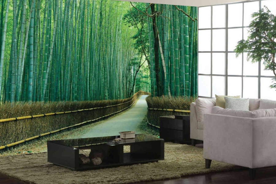
General Design Tips For Color Theory
Color choices do more than set the mood. They shape how a space feels, flows, and functions when paired thoughtfully with light, texture, and proportion.
- Warm colors in the ceiling combined with the cooling effect of a blue-colored wall create a balance of energy and calmness. This is a space that feels welcoming and spacious.
- Colors should always be tested in real lighting conditions to see how they will appear with textures, tiles, and panels.
- Texture affects color. An even surface reflects light differently than the textured 3D wall panels or the ceiling tiles.
- Neutrals are useful to balance stronger decisions, whether it be through murals, panels, or ceiling treatments.
- Decide where the focal points are. Use strong colors on the focal points and other colors that are complementary or neutral.
When color decisions are made with balance and intention, the result is a space that feels put-together, comfortable, and visually engaging rather than overwhelming.
Color & Ceiling Design Mistakes to Avoid
Even well-intentioned color choices can fall flat if foundational design principles are overlooked.
- Applying bold colors on multiple surfaces without hierarchy.
- Ignoring undertones when combining different finishes.
- Overlooking lighting conditions and their effect on color perception.
- Allowing texture and scale to be secondary to color choices.
Avoiding these mistakes helps to make sure the design is intentional, harmonious, and functional.
Using Color Theory
Color theory is much more than an afterthought in decoration. It is a precise design tool that shapes how a space looks and feels. When applied to ceiling tiles, 3D wall panels, and wall murals, color enhances architectural elements, creates visual focus, and influences how a space is perceived by its users. By understanding the purpose of each space and applying color with intention (considering texture, placement, and proportion) designs become both functional and visually compelling. Explore Talissa Decor and discover how our designs can transform your space.