 Largest Ceiling
  CALL :
  About us
 FAQs
FAQs Gallery
 Contact


 Ceiling Planks
 2×2 PVC Ceiling Tiles
 Styrofoam Ceiling Tiles
 Wall Mural
 3D Wall Panels
 Crown Moldings
 Faux Wood Beams
 Other Products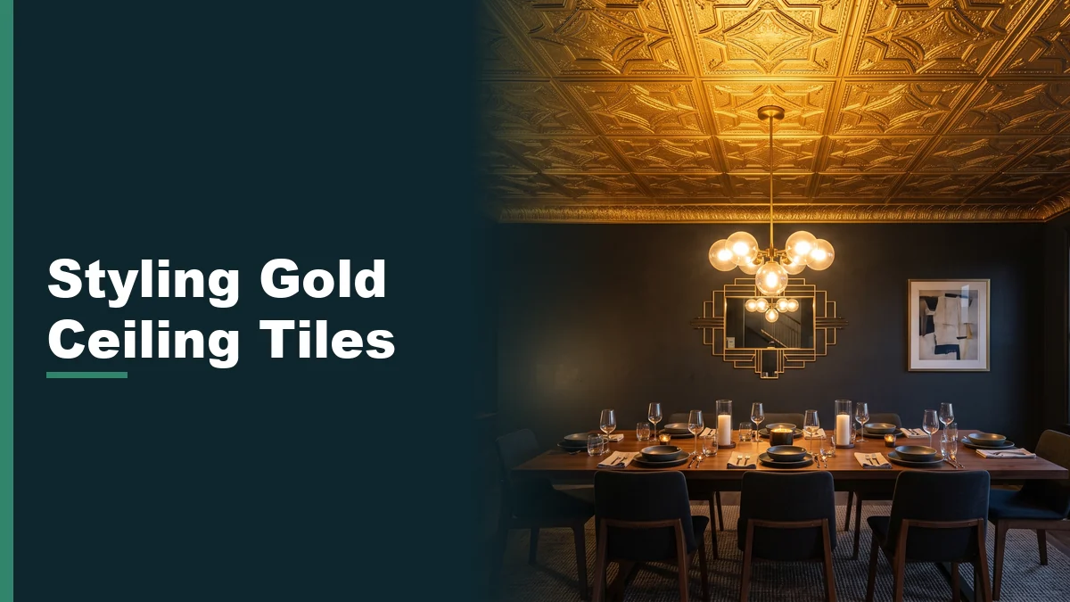
How to Incorporate Gold Ceiling Tiles into a Modern Decor Scheme
You are standing under a plain white ceiling in a dining room you are finally redoing, and you want something with presence, without it turning into the room everyone mentions for the wrong reasons. That is the exact line our gold ceiling tile finishes are meant to walk. Done well, gold ceiling tiles fit modern decor the way a piece of good jewelry fits an outfit: noticed, not shouted.
Done badly, the same tile reads as a hotel lobby from 1998. The difference almost never comes down to the tile itself. It comes down to finish, scale, what is on the walls, and what kind of light is hitting it at seven in the evening.
Where gold ceiling tiles fit modern decor, and where they do not
Gold works best as a ceiling, in our experience, when it has one job in the room. A dining room, an entry, a powder room, a bar nook: contained spaces where you look up on purpose and the ceiling gets to be the moment. Spread the same finish across an open-plan kitchen and living room and it stops being a feature and starts competing with everything else in the sightline, including itself.
The other variable is how much bare gold the eye actually sees. A gold tile with a busy relief pattern, deep shadow lines and plenty of texture reads as ornate and layered even in full sunlight. A smooth, minimalist gold panel with almost no relief reads as sleek and architectural. Both are legitimately gold ceiling tiles for modern decor. They just belong in different rooms.
Did you know
Our gold finishes come out of pattern families with real design history behind them: Art Deco, Victorian floral, Oriental, medieval and clean modern minimalist among them. A room already leaning traditional usually takes a Victorian or Art Deco pattern in gold far better than a minimalist one, and a contemporary room tends to run the opposite way.
Matte versus polished, and why the difference matters more than the color
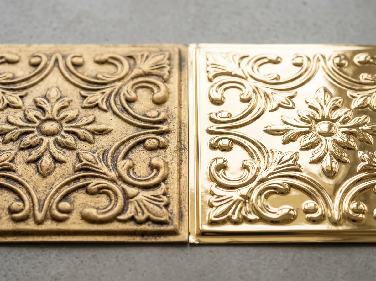
Matte and brushed gold
A matte or antiqued gold, softer and slightly warmer, absorbs light instead of throwing it back. It reads as settled and a little historic even in a new build, which is why it tends to work in rooms with warm wood floors, aged brass hardware or traditional millwork already in place.
Polished and bright gold
A polished, brighter gold bounces light hard, which is exactly what makes it feel glamorous under the right fixture and gaudy under the wrong one. It suits rooms that are otherwise fairly restrained, so the ceiling gets to be the one loud gesture instead of one of several competing for attention.
If you are torn between the two, a softer champagne gold finish sits in between: enough shine to feel intentional, enough warmth to avoid looking like a costume shop prop. Get the finish right and gold ceiling tiles become modern decor instead of an afterthought bolted onto a plain ceiling.
What to pair a gold ceiling with: walls, metals and furniture
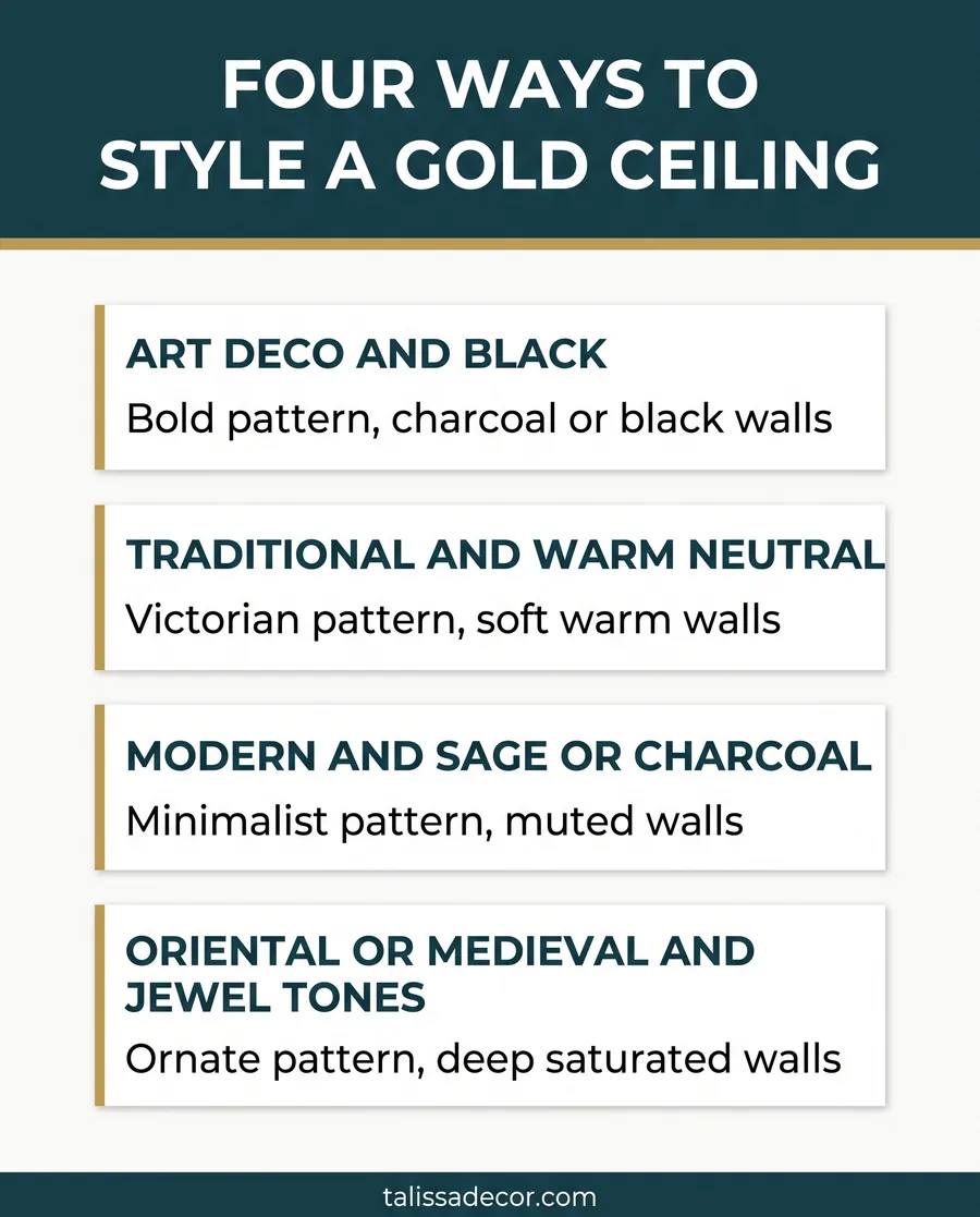
Deep, saturated wall colors are the most reliable partner for a gold ceiling: charcoal, ink navy, forest green, a warm terracotta. The contrast lets the gold read as a highlight instead of just another warm tone in a room already full of them. A warm white or soft greige wall works too, and reads calmer, but it asks more of a warmer antique gold tone specifically, since a cool bright gold against a cool white wall can feel a little sterile.
On metals, the safest move is to let the ceiling be the one gold moment and pick a single secondary metal for hardware, light fixtures and picture frames rather than three competing finishes. Brushed brass and warm gold sit together without friction because they are close cousins. Cool chrome or polished nickel against a warm gold ceiling can work, but it reads as a deliberate contrast, not an accident, so commit to it in more than one place in the room if you go that route.
Lighting changes how gold reads more than any other single choice
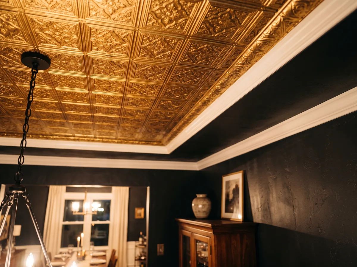
The same gold ceiling tile photographs differently under a showroom’s daylight bulbs than it will look above your dinner table at night, and that gap catches people off guard more than almost anything else in this guide. Warmer light, generally the lower end of the color temperature range that the Illuminating Engineering Society and lighting manufacturers describe as warm white, tends to deepen a gold finish and make it feel rich rather than shiny. Cooler, whiter light tends to flatten gold and can push it toward looking more like brass or even pale yellow than gold.
Pro tip
Before you order, request a finish sample and hold it under the actual fixture that will light the room, at the time of day you will actually use it. A gold tile that looks perfect under office fluorescents at noon can read completely differently under a warm dimmed pendant at eight in the evening.
Scale and pattern: matching the tile to the room
A small room, a powder room or a narrow entry, generally carries a finer, tighter repeat pattern better than a large bold one, since a big motif has less room to breathe before it starts looking cramped. A larger dining room or a great room ceiling can carry a bolder Art Deco or Royal-style pattern in gold without it overwhelming the space, simply because there is more distance and more surrounding detail to balance it. That is the whole exercise: matching gold ceiling tiles to a modern decor scheme that already knows what it wants to be.
If you want the gold moment without covering the whole ceiling, a gold-finished ceiling medallion over a dining table or a bed does the same job at a fraction of the surface area, and it pairs naturally with a plain painted ceiling around it rather than requiring the whole plane to match.
Download the free quick guide
A printable reference for matching gold ceiling tiles to wall colors, metal finishes and lighting, plus what to ask for when you request a sample.
Frequently asked questions
Do gold ceiling tiles work in a small room, or only a large one?
They work in both, but the pattern should change with the room. A small space like a powder room or a narrow entry generally suits a finer, tighter repeat, since a large bold motif has less room to breathe before it feels cramped. A larger room can carry a bolder pattern without it taking over. Gold ceiling tiles fit modern decor in either size room as long as the scale of the pattern is chosen for the space, not just the finish.
What wall color pairs best with a gold ceiling?
Deep, saturated colors tend to be the most reliable partner: charcoal, ink navy, forest green or a warm terracotta all let the gold read as a highlight rather than just another warm tone in the room. A warm white or soft greige wall also works and reads calmer, though it generally asks for a warmer antique gold rather than a cool, bright one, since a cool gold against a cool white wall can feel a little flat.
Should I mix gold with other metal finishes in the same room?
You can, and brushed brass mixes with warm gold especially easily since the two are close in tone. The safer approach for most rooms is to let the ceiling be the one gold statement and choose a single secondary metal for hardware, fixtures and frames, rather than three or four competing finishes. If you want to contrast gold with something cooler like chrome or nickel, repeat that cooler metal in more than one place so it reads as a deliberate choice.
Does lighting really change how a gold ceiling tile looks?
Yes, more than almost any other single factor in this guide. Warmer light tends to deepen a gold finish and make it feel rich, while cooler, whiter light tends to flatten it and can push it toward looking more like brass or pale yellow. The same tile can look completely different under a showroom’s daylight bulbs than it will above your table at night, which is exactly why holding a sample under your own fixtures matters before you order.
Is a full gold ceiling too much, or should I start with a medallion?
That depends on how bold you want the room to feel and how permanent you want the look to be. A full ceiling in gold tile is a strong, defining statement that suits a dining room, bar or entry meant to be noticed. A gold-finished ceiling medallion over a table or a bed gives you the same warmth and shine in a contained area, paired with a plain painted ceiling around it, which is a gentler way to test whether you like gold overhead before committing to the whole plane.
Gold ceiling tiles belong in modern decor when the finish, the scale and the light have all been chosen on purpose, not just the color. Start with the room’s job, pick a finish that matches its mood, and test it under real light before anything goes on the ceiling.
If you want a second opinion on a finish or a pattern before you commit, ask our team about ceiling tile samples and we will help you narrow it down to two or three worth living with for a week.